

Typography plays an important role in how people experience digital content. From social media profiles and personal blogs to website layouts and digital artwork, the appearance of text can influence how a message feels before someone even reads its meaning. A carefully chosen typeface can make content look elegant, playful, modern, minimal, or artistic. As online communication becomes increasingly visual, creators are paying more attention to the way words look as well as what they say. This growing interest has made decorative lettering and creative text styles popular among social media users, designers, students, and digital content creators.
An aesthetic font is a text style that adds personality and visual appeal to written content. It can include elegant serif lettering, handwritten scripts, rounded characters, minimalist typography, retro-inspired designs, and decorative Unicode characters. These styles help people express their identity, establish a recognizable visual theme, and make ordinary text feel more distinctive. Whether someone is designing a social media biography, creating a digital invitation, building a personal website, or preparing a presentation, the right typography can make the final result more memorable. Understanding different styles and knowing when to use them makes it easier to create attractive content without sacrificing readability.
What Is an Aesthetic Font?
An aesthetic font refers to a typeface or stylized text appearance chosen primarily for its visual character and ability to communicate a particular mood. Unlike plain, functional text, decorative typography often contributes to the overall personality of a design. For example, thin serif letters can suggest sophistication, while rounded sans-serif characters may communicate friendliness and simplicity. Handwritten lettering can create a personal feeling, whereas bold geometric fonts often suit contemporary branding and technology-focused projects.
The term is also widely used for stylized text created with special Unicode characters. These characters can resemble cursive writing, bold letters, small capitals, or unusual mathematical symbols. People frequently use them to decorate usernames, profile descriptions, captions, and short messages. However, it is important to understand the difference between a real font and a collection of special characters. A font changes how supported characters appear on a device, while Unicode styling replaces ordinary letters with different encoded characters. This distinction affects accessibility, searchability, copying, and compatibility across digital platforms.
Why Stylish Typography Is Popular in Digital Culture
Digital communication has become more visual, especially on platforms where users scroll through large amounts of content in a short time. A distinctive headline, well-designed profile, or thoughtfully formatted caption can help a creator establish a recognizable style. Typography also allows people to communicate emotions without adding extra words. Soft lettering may feel romantic, bold characters can express confidence, and vintage-inspired designs may suggest nostalgia or creativity.
Another reason for the popularity of decorative text is the growing importance of personal branding. Influencers, small-business owners, freelancers, artists, and online communities often develop consistent visual identities to make their content recognizable. Choosing complementary fonts for profile graphics, promotional materials, and website headings can support that identity. Nevertheless, attractive lettering is only one part of successful communication. Content still needs to be relevant, useful, and easy to understand. The strongest designs combine visual appeal with clear messaging rather than relying entirely on unusual characters to attract attention.
Popular Types of Aesthetic Typography
Different typography styles create different impressions, which makes choosing the right one an important design decision. Some styles work particularly well for elegant branding, while others suit casual social posts, creative portfolios, or playful digital projects. Understanding these categories helps users select typography that supports their purpose instead of choosing a style simply because it looks unusual.
Elegant Serif Fonts
Serif fonts feature small strokes or finishing details at the ends of many letters. These features can create a traditional, refined, or editorial appearance. Elegant serif typefaces are commonly used in fashion branding, magazine headlines, wedding invitations, book covers, and premium product packaging. Their distinctive shapes can make short headings look sophisticated without requiring additional decorative elements.
When using serif typography, consider the size and spacing of the text. Thin strokes may look beautiful in large headings but become difficult to read at small sizes, particularly on mobile screens. A practical approach is to use an expressive serif typeface for headings and a simpler font for longer paragraphs. This combination creates contrast while preserving readability.
Minimalist Sans-Serif Fonts
Sans-serif fonts generally lack the finishing strokes associated with serif typefaces. Their clean shapes make them suitable for modern websites, mobile applications, business presentations, and contemporary social media graphics. Minimalist typography often relies on balanced spacing, consistent alignment, and simple letterforms instead of elaborate decoration.
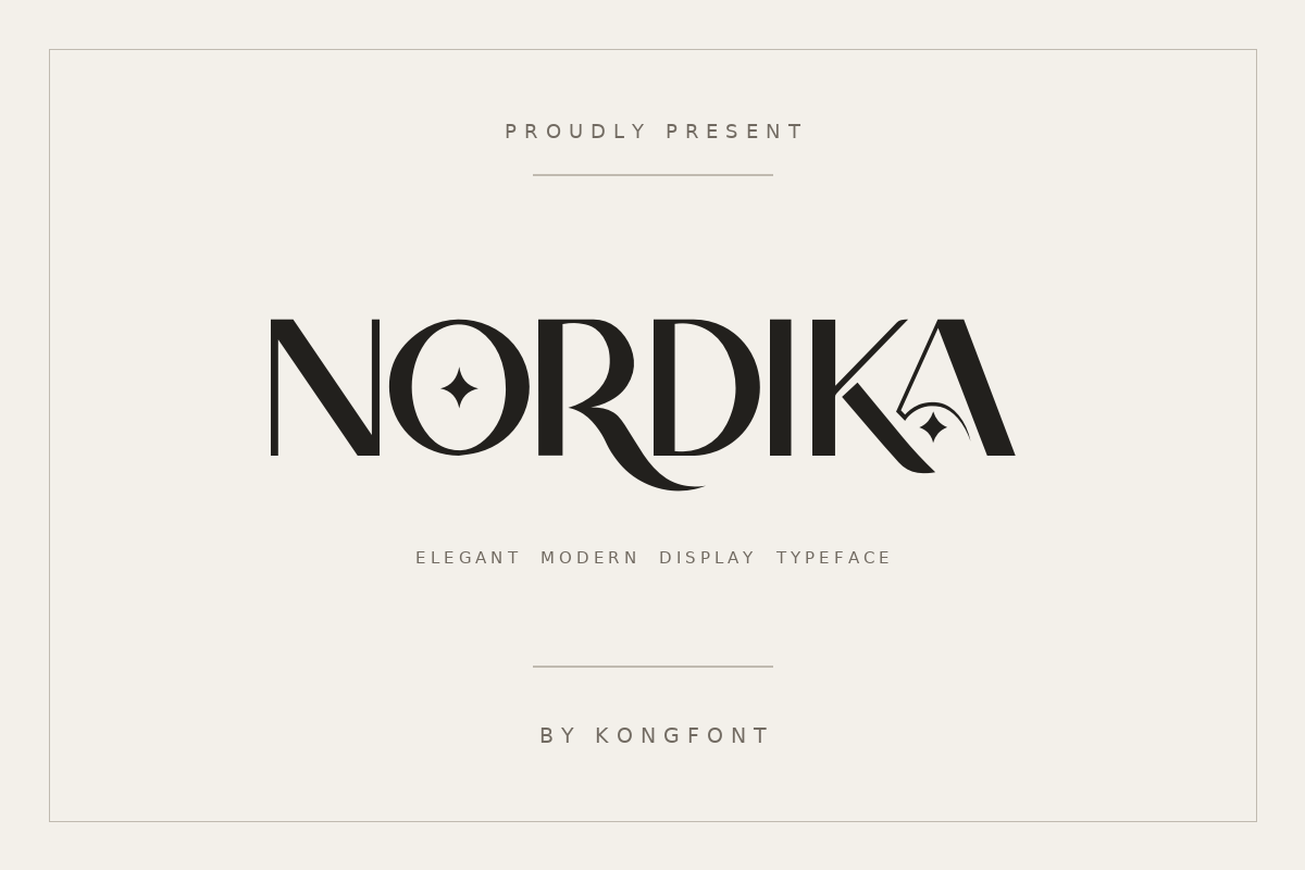
This style works especially well when the message needs to feel direct and professional. For example, a designer creating a portfolio can use a clean sans-serif font for navigation and body text while introducing a slightly heavier variation for headings. The result can feel polished without distracting visitors from the work being presented.
Handwritten and Cursive Fonts
Handwritten and cursive styles imitate the appearance of writing by hand. Depending on their design, they can feel personal, romantic, artistic, or informal. These typefaces are popular for greeting cards, invitations, lifestyle graphics, creative signatures, and short inspirational messages. They can also help small businesses create a warmer visual identity when used thoughtfully.
However, script fonts are not ideal for every situation. Highly connected letters and elaborate flourishes may become difficult to recognize when displayed in small sizes or in long passages. Using handwritten typography for a short phrase or heading is generally more effective than applying it to an entire article. The surrounding design should remain simple enough to let the lettering stand out.
Retro, Gothic, and Decorative Styles
Retro typography draws inspiration from earlier design periods, including vintage advertisements, old-fashioned packaging, and classic poster lettering. Gothic styles often feature dramatic strokes and angular forms, creating a bold or mysterious impression. Other decorative styles use unusual proportions, outlined characters, playful shapes, or exaggerated letterforms to create a distinctive visual effect.
These styles can work well for music artwork, gaming profiles, themed events, posters, and creative communities. Their effectiveness depends on context. A dramatic Gothic font may suit a music poster but feel inappropriate on a professional consulting website. Matching the typography to the audience and purpose ensures that the design communicates the intended message.
How to Choose the Right Style for Your Needs
Selecting typography becomes easier when you begin with the purpose of the content. A social media biography has different requirements from a business presentation, just as a wedding invitation differs from a technology blog. Before choosing a design, consider the mood you want to communicate, the amount of text involved, the device on which it will appear, and the expectations of your audience.
The best aesthetic font for a project should support the message rather than compete with it. A simple, readable typeface may be ideal for educational content, while an expressive display font may work better for a short creative headline. It is also useful to consider how the selected style will combine with images, colors, backgrounds, and other design elements. A consistent visual system generally looks more professional than a collection of unrelated decorative styles.
| Typography style | Best use | Visual impression |
|---|---|---|
| Serif | Editorial content, invitations, premium branding | Elegant and traditional |
| Sans-serif | Websites, applications, presentations | Clean and modern |
| Handwritten | Personal graphics, cards, creative quotes | Warm and expressive |
| Retro | Posters, themed artwork, lifestyle designs | Nostalgic and distinctive |
| Gothic | Music graphics, gaming, dramatic artwork | Bold and mysterious |
| Rounded | Friendly brands, casual social content | Approachable and playful |
The table provides general guidance rather than strict rules. Individual typefaces within each category can have very different personalities, so previewing the actual letters in your intended layout is always worthwhile.
Using Stylish Fonts on Social Media
Social media profiles provide a convenient space for experimenting with typography. Creators often customize profile descriptions, highlight covers, captions, and promotional graphics to make their accounts visually consistent. A decorative heading can establish a theme, while a simple body font ensures that longer messages remain comfortable to read. Even small changes in letter spacing, capitalization, and alignment can improve the overall appearance of a profile.
When choosing a font for social platforms, check how it appears on different devices. A style that looks attractive on a desktop computer may render differently on a smartphone. Special Unicode characters can also appear as empty boxes or substitute symbols on some systems. In addition, stylized characters may be harder for screen readers to interpret and may not work reliably in platform searches. For important information, use ordinary text and reserve decorative lettering for optional visual elements.
Creating Stylish Text Without Design Experience
You do not need advanced graphic design skills to experiment with decorative typography. Many design applications include built-in font libraries, text effects, and templates that make it easy to create polished graphics. Users can test different typefaces, adjust letter spacing, change the weight of a heading, and compare combinations before choosing a final design.
For profile text, special-character generators are another common option. These tools transform ordinary words into visually different character combinations that can sometimes be copied into social media fields. Before using such text, verify that the characters display correctly and remain understandable. For professional documents and website content, selecting an actual font within a design or publishing application is usually a more dependable choice because it provides greater control over appearance and accessibility.
A simple process can help beginners achieve better results:
-
Start with one clear design goal, such as elegance, simplicity, or playfulness.
-
Choose one main typeface and, if necessary, one complementary typeface.
-
Preview the text at the actual size and on the devices your audience uses.
-
Check readability, character compatibility, and consistency before publishing.
Following these steps makes typography experimentation more purposeful. Instead of adding several effects at once, change one element at a time and evaluate how it affects the design.
The Role of Typography in Branding and Website Design
Typography is a key part of brand identity because it helps businesses communicate personality consistently. A financial services company may prefer clean, dependable lettering, while a creative studio might choose a more expressive combination. Restaurants, fashion labels, online stores, and independent creators can all use typefaces to establish a visual tone that customers begin to associate with their products or services.
Website design requires additional attention because typography affects both appearance and usability. Headings should establish a clear hierarchy, body text should remain readable, and navigation labels should be easy to recognize. Designers should also consider line height, paragraph width, contrast, and responsive layouts. A decorative typeface can be effective in a logo or page heading, but using it throughout a website may make reading tiring. Consistency across headings, buttons, and body text creates a more coherent experience.
Accessibility and Readability: What to Consider
Visual creativity should not come at the expense of accessibility. Some decorative characters resemble familiar letters but are technically different symbols. Screen readers may pronounce them unexpectedly, skip them, or interpret them inconsistently. Users who rely on assistive technology can therefore find heavily stylized profile descriptions and messages more difficult to understand. Unusual symbols can also interfere with text selection, translation, and search functionality.
To create inclusive digital content, use standard text for essential information such as contact details, instructions, product descriptions, and important announcements. Choose adequate font sizes, maintain sufficient contrast between text and background, and avoid excessively thin lettering for long passages. When a decorative style is important to the design, pair it with a plain-text version of the message wherever practical. These small decisions help ensure that visual expression remains accessible to a wider audience.
Common Typography Mistakes to Avoid
One frequent mistake is using too many font styles in a single design. Although every typeface may look appealing on its own, combining several unrelated styles can make the layout feel disorganized. A more effective approach is to establish a limited typography system with a clear hierarchy. For example, use one font for headings, another for body copy if needed, and a consistent weight or size for supporting information.

Another common problem is choosing appearance over legibility. Extremely decorative lettering may be suitable for a short title but unsuitable for an article, product description, or mobile navigation menu. Designers should also avoid excessive capitalization, inconsistent spacing, and decorative symbols that add clutter without improving the message. Testing the design at different screen sizes can reveal issues that are not immediately obvious when working on a large monitor.
Current Typography Trends and Future Possibilities
Contemporary digital design increasingly combines personality with practical usability. Variable fonts allow designers to adjust characteristics such as weight and width within a supported typeface, providing more flexibility without requiring a separate font file for every variation. Responsive typography also helps text adapt to different screen sizes, while modern design systems make it easier to maintain consistent styles across websites and applications.
At the same time, expressive lettering continues to have a place in personal branding and creative content. Some designers combine understated body text with oversized headings, while others experiment with retro influences, soft rounded letters, or contrasting serif and sans-serif combinations. Artificial intelligence tools are also making it easier to explore visual directions and generate initial design ideas. However, automated suggestions still require human judgment. Designers must evaluate readability, licensing, cultural context, and consistency before using a typeface in a finished project.
The most useful trend is not necessarily the most unusual one. Instead, successful typography balances originality with clarity. As digital content becomes more competitive, creators who understand the purpose behind their font choices can produce designs that feel distinctive without becoming difficult to use.
Conclusion
Typography is much more than a decorative finishing touch. It influences how people interpret messages, recognize brands, and interact with digital content. From elegant serif lettering and modern sans-serif styles to handwritten scripts and dramatic decorative designs, every typeface offers a different way to communicate personality. Understanding these differences helps creators make thoughtful choices for social media profiles, websites, presentations, invitations, and marketing materials.
An aesthetic font can make a design more expressive when it complements the content and serves a clear purpose. The key is to balance creativity with readability, accessibility, and consistency. Experiment with a few styles, preview them in their intended setting, and choose the option that best supports your message. By treating typography as a meaningful part of communication rather than a simple visual effect, you can create digital content that looks polished, feels authentic, and remains useful to its audience.

